Introduction:
HTML is a markup language that uses tags and codes to aid in the creation of a web-based software. It is made up of different components such as forms, tables, links and many more. The Forms and Input tags in HTML is a component of the HTML webpage that is used to accept and store records. Every web page require a record that is use to gain access or keep documentation which is aided by forms and input tags in html
Forms and Input tags in HTML
The form is a set of inputs that accepts records from the users of the webpage. The form concepts in HTML will be discussed in the following ways:
- Code syntax
- Code example
- Code output
Code syntax:
The tags that are used to make a form include;
- <form>: it is a tag that is used in the creation of form.
- <fieldset>: it is a tag that creates a border line around the form.
- <label>: It is a tag that is used to place a name identifier for the form.
- <input>: it is a tag that is used to accept record of different types.
The attributes used are:
- Type: it is an attribute that is used to define the input that will be accepted.
- Placeholder: it is used to describe the input that is accepted
- Src: source is an attribute used with image inputs
For further references read the following:
- W3schools: https://www.w3schools.com/html/html_forms.asp
- Tutorialpoint: https://www.tutorialspoint.com/html/html_forms.htm
The image below shows the syntax to applying forms and input

Code example:
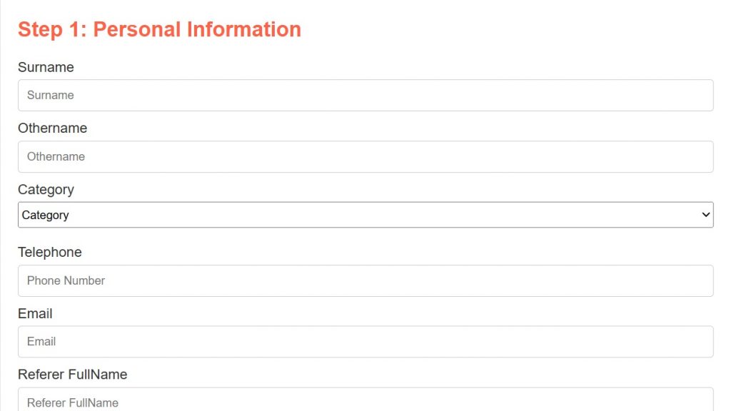
The image below shows the example of the application of a form

Code Output
The image below is the output

Input types in HTML:
Here is a comprehensive list of all the input types available in HTML, along with a brief description of their purposes:
- Button: Defines a push button. This is typically used with javascript to trigger actions.
- Checkbox: Defines a checkbox. Users can select zero or more options from a set.
- Color: Defines a color picker. This allows users to select a color, often with a color swatch or a system color picker.
- Date: Defines a control for entering a date (year, month and day). The user interface can vary based on the browser and operating system.
- Datetime-local: Defines a control for entering a date and time (without the time zone).
- Email: Defines a field for an e-mail address. Browsers typically validate the input to ensure it’s in a valid email format.
- File: Defines a file-select field and a “Browse…” button for file uploads.
- Hidden: Defines a hidden input field. It’s not displayed to the user but is submitted with the form data. Useful for storing data that needs to be passed to the server.
- Image: Defines an image as a submit button. When clicked, it submits the form. You specify the image source using the “src” attribute.
- Month: Defines a control for entering a month and year.
- Number: Defines a field for entering a number. Browsers might provide up/down arrows to increment/decrement the value.
- Password: Defines a password field. The characters entered are typically masked (e.g., with asterisks or dots).
- Radio: Defines a radio button. Users can select only one option from a set of mutually exclusive choices.
- Range: Defines a control for entering a number whose exact value is not important (e.g., a slider control).
- Reset: Defines a reset button. When clicked, it resets all form fields to their initial values.
- Search: Defines a single-line text field for entering search strings.
- Submit: Defines a submit button. When clicked, it submits the form data to the server.
- Tel: Defines a field for entering a telephone number. On mobile devices, this might trigger a numeric keypad.
- Text: The default value. Defines a single-line text field. This is the most commonly used input type.
- Time: Defines a control for entering a time (hour and minute).
- Url: Defines a field for entering a URL. Browsers typically validate the input to ensure it is in a valid URL format.
- Week: Defines a control for entering a week and year.


